A perfectly styled room can still feel strangely hollow. Smooth cabinetry, sharp-edged furniture, and flawless finishes often remove the very thing that makes a space feel grounded. That tension is exactly where the question “what does wabi sabi mean” becomes relevant in modern interiors. Beyond its philosophical roots, Wabi-Sabi in wall art is about introducing irregularity, erosion, and tactile depth into otherwise controlled environments. It replaces sterile perfection with surfaces that feel aged, imperfect, and quietly alive—often through raw texture, uneven composition, and restrained earth-toned palettes.
Wabi Sabi as a material language, not a slogan
Wabi-Sabi is often reduced to vague ideas like “beauty in imperfection,” but in interior design, it behaves more like a material decision than a philosophy. It shows up through surfaces that feel incomplete, slightly weathered, or shaped by time rather than precision.
On a wall, this translates into visible inconsistencies: raised paint ridges that catch light unevenly, matte finishes that absorb rather than reflect, and compositions that resist symmetry. These details are not decorative accidents. They are deliberate interruptions to visual perfection, which is why flat, digitally printed art rarely captures the essence of Wabi-Sabi.
In contemporary minimalist architecture—especially Japandi or organic modern spaces—this material language becomes essential. Without it, rooms risk feeling overly engineered. With it, they gain quiet depth.
Why flat prints fail in a Wabi Sabi interior
A common misunderstanding is labeling soft-toned abstract prints as “Wabi-Sabi.” The issue is not color—it is surface.
Printed artwork is inherently uniform. Every inch is identical in thickness, texture, and finish. This uniformity contradicts the core of Wabi-Sabi, which depends on irregularity and natural variation.
A textured canvas, by contrast, interacts with light throughout the day. Morning light may reveal subtle plaster-like cracks, while evening shadows deepen the relief of palette knife strokes. This shifting visual experience creates a sense of time passing across the surface—something a flat print cannot replicate.
A frequent design misstep occurs in high-end minimalist bedrooms: soft beige or gray posters are chosen to “keep things calm,” but under warm lighting, they disappear entirely. The wall becomes visually empty instead of restful. A textured Wabi-Sabi canvas in the same palette would hold presence without adding noise.
How Wabi Sabi wall art grounds modern spaces
In low-light bedrooms, meditation rooms, or quiet reading corners, Wabi-Sabi art works less as decoration and more as an anchor.
The grounding effect comes from three interacting factors:
-
Visual weight created by uneven texture and layered pigment
-
Earth-based color palettes that echo natural materials like clay, sand, and stone
-
Asymmetrical balance that feels organic rather than engineered
For example, a canvas with soft charcoal waves flowing across a bone-white base introduces movement without chaos. Similarly, a beige plaster-like composition with cracked, layered texture can echo the feel of aged walls or sun-worn surfaces, even in a newly built apartment.
This is why Wabi-Sabi art often pairs well with materials like linen upholstery, raw wood, travertine, and limewash finishes. It does not compete—it resonates.
The 4 pillars of a true Wabi Sabi canvas painting
This section reflects the most actionable way to recognize authentic Wabi-Sabi wall art in modern interiors:
-
Irregular surface relief, visible ridges, cracks, or layered paint that creates shadow variation
-
Earth-driven palette, including warm beige, ochre, clay, soft black, bone white, and muted gray
-
Asymmetrical composition, avoiding centered or perfectly balanced layouts
-
Matte, light-absorbing finish, preventing glare and allowing depth to emerge gradually
When these four elements are present together, the artwork behaves less like an object and more like an extension of architectural material.
Choosing the right piece without over-styling the room
Wabi-Sabi interiors depend heavily on restraint. Adding the wrong artwork can easily disrupt that balance.
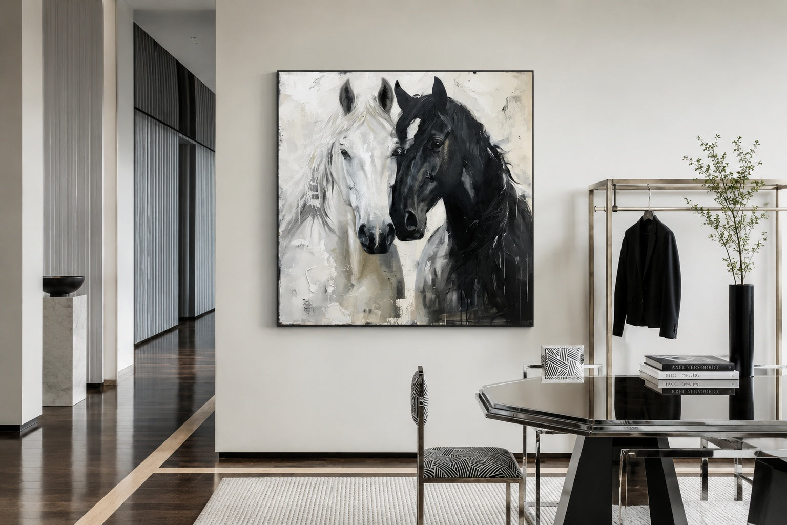
Scale is often the first decision point. A large, singular canvas tends to work better than multiple small pieces, especially on expansive walls. It allows the texture to read clearly from a distance and avoids visual fragmentation.
Color should not introduce contrast for its own sake. Instead, it should sit within the existing palette, slightly darker or lighter than surrounding materials. For example, in a soft beige bedroom, a slightly deeper sand-toned painting with subtle black accents can create depth without breaking the calm.
Texture intensity also matters. Heavily sculpted surfaces suit larger walls with breathing room, while softer, flatter textures work better in tighter spaces where heavy relief might feel overwhelming.
Where handcrafted textured art fits into this philosophy
Because Wabi-Sabi depends on unpredictability, it cannot be convincingly replicated through mass production. Each variation in drying time, pressure, and layering contributes to the final surface.
This is where hand-painted textured canvas becomes relevant. Collections like the handcrafted wabi-sabi art catalog focus on these irregularities—uneven gesso, organic flow, and restrained palettes that align with the philosophy rather than merely referencing it.
Specific works such as a beige minimalist abstract with plaster-like layering or a black wave composition with flowing asymmetry illustrate how subtle movement and texture can define a room without dominating it.
For buyers hesitant about committing to large-scale textured art, the key reassurance lies in its adaptability. Unlike bold graphic pieces, Wabi-Sabi canvases tend to age well within a space because they do not rely on trend-driven color or sharp contrast.
When Wabi Sabi wall art may not be the right choice
Despite its versatility, Wabi-Sabi is not universally suitable.
In highly polished interiors—such as glossy marble spaces with chrome finishes or ultra-modern high-gloss cabinetry—the rawness of textured art can feel disconnected. The contrast may appear intentional, but often it reads as unresolved rather than harmonious.
Similarly, in very small or visually crowded rooms, heavy texture can create unnecessary density. In those cases, a lighter-touch approach or smaller-scale work may be more appropriate.
Understanding these limits prevents the style from becoming forced or superficial.
Extending the look across minimalist interiors
Once the wall art sets the tone, the rest of the room can follow subtly. The goal is not to match but to echo.
Soft textiles, slightly imperfect ceramics, and natural materials can reinforce the same language of imperfection. However, restraint remains critical. Too many “rustic” elements can dilute the quiet sophistication that defines modern Wabi-Sabi spaces.
For those refining a broader aesthetic direction, exploring related pieces like minimalist raw texture paintings can help maintain consistency across different rooms without repeating the exact same visual.
Frequently Asked Questions
What are the core elements of Wabi Sabi art in modern home decor?
The core elements are irregular texture, muted earth-tone palettes, asymmetrical composition, and a matte, non-reflective surface. Together, these create depth and calm without relying on bold contrast or perfect geometry.
Why does real textured artwork fit the Wabi Sabi aesthetic better than a printed poster?
Real textured artwork introduces natural variation through physical layers and drying processes, which create shifting light and shadow. Printed posters are uniform and flat, which contradicts the imperfect and time-influenced nature of Wabi-Sabi.
What colors work best for Wabi Sabi wall art?
Warm neutrals such as beige, clay, ochre, bone white, and soft charcoal work best. These colors echo natural materials and avoid sharp contrast, helping the artwork blend into the space rather than dominate it.
Is Wabi Sabi suitable for minimalist interiors?
Yes, it is particularly effective in minimalist interiors because it adds depth and warmth without increasing visual clutter. It balances clean lines with organic imperfection.
How large should a Wabi Sabi painting be for a living space?
In most cases, a larger single piece works better than multiple small ones. It allows the texture to be visible and prevents the wall from feeling fragmented, especially in open or uncluttered spaces.