A mountain painting can either anchor a room or quietly disappear into it, and the difference usually comes down to one overlooked factor: physical depth. Flat prints of alpine scenes often lose their authority at large scale, especially when placed above stone fireplaces or across double-height walls. The jagged force of a mountain range becomes a soft image rather than a structural presence. By contrast, 3D textured mountain paintings use heavy paint build-up to recreate the ridgelines, fractures, and snow shelves that define real terrain. Under directional lighting, these raised surfaces cast shifting shadows, allowing the artwork to behave less like an image and more like a geological feature within the space.
The architecture of stone is lost in flat mountain wall art
Most mountain wall art available online relies on photography or thin canvas printing. While visually appealing at small sizes, these formats struggle when scaled up. The issue is not just resolution or sharpness, but the absence of material structure.
Mountains are not gradients or color transitions. They are formed through tectonic pressure, fractured planes, and layered mineral mass. When translated into flat imagery, that physical logic disappears. What remains is a softened outline of something that should feel weighty and grounded.
A heavily textured mountain painting approaches the subject differently. Instead of depicting mountains, it constructs them. Thick gesso bases, palette-knife scoring, and layered oil mediums create actual ridges on the canvas. These raised forms catch light from different angles throughout the day, producing subtle shadow shifts that mimic how sunlight moves across real terrain.
This is why textured mountain and landscape paintings feel more convincing in architectural interiors. They respond to the room rather than sitting passively on the wall.
How heavy impasto techniques recreate alpine terrain
The defining characteristic of high-end mountain paintings is not color or composition, but surface relief. Heavy impasto techniques allow artists to build paint in layers thick enough to hold shape, almost like low-relief sculpture.
Instead of smooth blending, palette knives are used to carve and deposit paint in angular motions. This creates sharp transitions that resemble fractured rock faces and steep ridgelines. In snowy peak compositions, thicker white pigment is applied along upper planes, forming raised “snow shelves” that physically sit above darker base layers.
What makes this especially effective in modern interiors is how the texture interacts with controlled lighting. Ceiling spotlights or wall washers strike the raised paint edges, producing fine shadow lines that change as you move through the room. The painting never looks static.
In contrast, a flat alpine print remains visually unchanged regardless of lighting. It cannot participate in the spatial rhythm of the room.
Why large scale is non-negotiable for mountain paintings
Mountain imagery demands space. Reducing it to a small canvas often strips away its intended impact, turning something monumental into decoration.
In open-plan living rooms or homes with tall ceilings, undersized art creates a visual imbalance. The wall feels incomplete, even if the artwork itself is technically “nice.” This is particularly noticeable when paired with materials like stone, concrete, or wide-plank wood, which already carry strong texture and presence.
A useful way to think about scale is to treat the painting as an extension of the architecture rather than an accessory.
Below is a practical sizing reference for mountain paintings in common interior settings:
When mountain paintings are scaled properly, they begin to define the room rather than simply decorate it.
Sizing and framing guidelines for large mountain wall art over fireplaces
Placing a mountain painting above a fireplace introduces both opportunity and risk. The setting naturally invites a focal piece, but proportions and framing choices determine whether the result feels intentional or awkward.
-
Keep width aligned with the mantel, ideally slightly narrower to avoid overhang.
-
Maintain breathing space above the mantel; avoid placing the artwork too high.
-
Choose horizontal formats for a calm, horizon-driven composition.
-
Use stretch + wood frame when pairing with natural materials like stone or timber.
-
Opt for frameless edges when aiming for a more contemporary, open feel.
Framing should not compete with the artwork’s texture. In many cases, overly ornate frames weaken the raw, geological quality that makes mountain paintings compelling.
Where textured mountain canvas fits in modern interiors
Textured mountain paintings are particularly effective in spaces that already emphasize material contrast. Think alpine modern homes, urban penthouses with concrete finishes, or transitional interiors mixing wood and metal.
In these environments, flat prints often feel disconnected. They lack the tactile presence needed to stand alongside materials like slate, limewash, or brushed oak. A textured mountain canvas, on the other hand, integrates naturally because it shares the same language of surface variation and depth.
A common design misstep is placing a large photographic mountain print above a stone fireplace. Instead of reinforcing the architecture, it looks visually thin, almost like a placeholder. The stone beneath feels heavier than the artwork above it, creating imbalance.
A well-executed abstract alpine painting avoids this issue by matching the visual weight of its surroundings. It does not need hyper-realistic detail; in fact, slightly abstracted forms often feel more refined and adaptable across seasons and lighting conditions.
For those exploring options, collections like textured mountain and landscape paintings provide examples of how surface depth and scale can be handled without leaning into rustic clichés.
When mountain paintings may not be the right choice
Despite their appeal, mountain paintings are not universally suitable. In compact rooms with low ceilings, heavily textured large-scale pieces can feel overwhelming. The raised surfaces may also cast stronger shadows than intended in tight spaces with limited lighting control.
Color palette is another consideration. Many mountain compositions rely on mineral tones—greys, off-whites, charcoal, and muted earth shades. In interiors already dominated by similar colors, the artwork can blend in too much unless the texture is pronounced.
There is also a stylistic boundary. Highly traditional or ornate interiors may not benefit from semi-abstract, impasto-heavy mountain art. The contrast can feel unresolved rather than intentional.
Recognizing these limits helps avoid forcing the wrong artwork into the wrong environment.
Choosing between horizontal sweep and vertical ascent
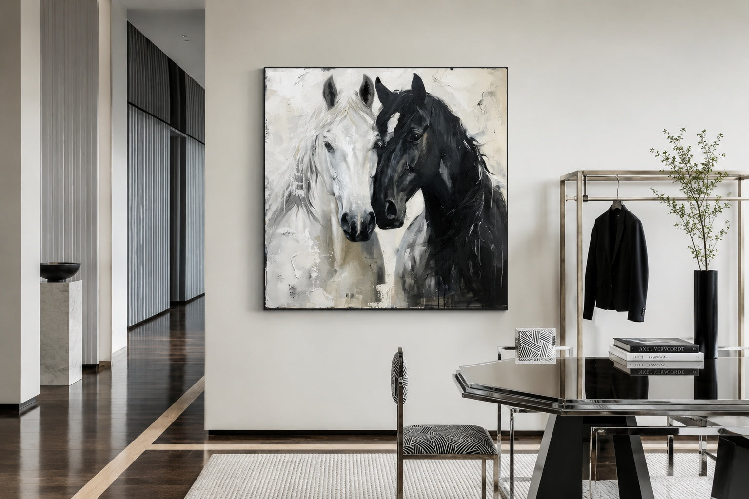
Orientation changes how a mountain painting interacts with the room. Horizontal compositions emphasize expanse and calm, making them well-suited for living rooms and dining areas. They mirror natural sightlines and help visually widen the space.
Vertical formats, by contrast, focus on ascent and height. These work best in stairwells, entryways, or double-height walls where the goal is to draw the eye upward.
For most residential settings, especially above sofas or fireplaces, horizontal formats are more versatile. If you are considering broader layouts, exploring large horizontal statement paintings for living rooms can clarify how scale and proportion translate into real interiors.
Frequently Asked Questions
Why should I choose a 3D textured mountain painting over a landscape photo print?
A 3D textured mountain painting offers physical depth that interacts with light, creating shadows and dimensionality that change throughout the day. Photo prints remain flat and static, which can make large walls feel less substantial.
What frame option works best for mountain paintings above a fireplace?
Simple wood frames or clean stretched edges tend to work best. They support the natural, architectural feel of the artwork without distracting from the textured surface.
Do textured mountain paintings work in modern interiors or only rustic homes?
They work particularly well in modern interiors, especially those with concrete, stone, or wood finishes. The key is choosing compositions that avoid overly literal or decorative styles.
How large should a mountain painting be for a living room wall?
Ideally, the artwork should span at least two-thirds of the furniture width beneath it. Larger is often better, as mountain imagery benefits from scale to maintain its visual impact.
Are abstract mountain paintings better than realistic ones?
In many cases, yes. Abstract interpretations tend to integrate more easily into contemporary interiors and avoid looking overly thematic or dated.